
Hi, everyone! My name is Opal Carew and this is my first post as a regular Genre-ista at Romancing the Genres. As mentioned in my introduction, I’m from Canada and I write erotic romance. I write three books a year for St. Martin’s Press, plus I write for Samhain Publishing, and I squeeze in a few self-published short stories and novellas between projects, or when I’m stalled.
This month’s topic is about hot summer reads. Well, at the mention of hot summer reads, my mind jumps right to the Fifty Shades of Grey trilogy. (Or were you hoping we wouldn’t go there?) I won’t talk about the books themselves; lots of people have done that on lots of different blogs. Instead, I’d like to talk about how their huge popularity is changing the landscape of romance, or at least erotic romance.
 |  |  |
Whether you loved the books or hated them, you have to admit that the trilogy is quite a phenomenon. It’s topping all the bestseller lists and movie rights have been sold.
Publishers are scrambling to catch the attention of that new set of readers. It makes sense. The trilogy has captured the interest of a huge new potential audience and those readers are looking for something similar to read. Publishers are trying to make it easier for them to find books along the same line. For instance, St. Martin’s Press, has set up a webpage to show off their contenders. They call it Fifty Shades Hotter.
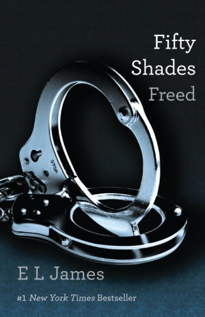
This bid for attention is causing a new trend in book covers. Grey covers are popping up everywhere.
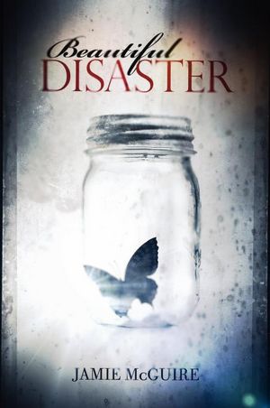 |  |
The books are monochrome with the focus on an object, and often the title offers a subtle splash of colour, like on BEAUTIFUL DISASTER by Jamie McGuire. On the cover of Sylvia Day’s book, BARED TO YOU, the yellow of the title is carried over to the cufflinks, too. I love this cover!
Publishers are even repackaging some of their older books with snazzy grey covers. For instance, my book BLUSH has a great new cover and will be popping up in bookstores soon. Also, Lora Leigh’s WILD CARD.
 |  |
My next two releases will also have grey covers. A different cover was originally designed for Illicit (February 2013) and has been on Amazon and Barnes and Noble for months now. The new cover isn’t public yet, but should be soon.
I like the simplicity and elegance of these covers and think it makes it easier for readers to identify some really hot (or should I say sizzling) reads.
What do you think of this trend?
7 comments:
If this new packaging and new awareness of romances brings more readers I'm all for it. I think the classier covers is a great idea.
Welcome Opal,
I agree with Paty about introducing new readers to romance. Titles, covers, and author names are what readers first see when looking for a book. For a debut or newer authors, the title and cover is critical for readers to find them. Anything that helps a book stand out from the thousands of others is a boon to the author.
Paty, I agree, too. I think it's great when any trend increases awareness of how awesome romances are.
So true, Judith; it's tough to get noticed out there. Hopefully, this trend will help a lot of authors, and readers, too!
Hi Opal,
I really like the monotone colors with a focus on an object. It's very similar to the Twilight series covers, which I thought really helped make the books stand out from the pack. I'm looking forward to seeing your covers.
Brenda, you're right. The Twilight series did use the same idea. I hadn't even thought about that!
The elegant gray covers are lovely, but I like color and think we'd soon grow tired off this trend. It makes a change and catches our attention, but then we'd soon need a change from gray.
Hi, Opal! I've always liked the simpler, cleaner look on covers. Many books in the YA genre have a touch of that simplicity and I find it very appealing and intriguing. Congrats on the new cover for BLUSH...stunning!
Post a Comment